Sporting Equipment E-Commerce Store
Industry
Sports & Retail
Client
Self-Initiated Project
Duration
3 Weeks
Industry
Sports & Retail
Client
Self-Initiated Project
Duration
3 Weeks
Overview
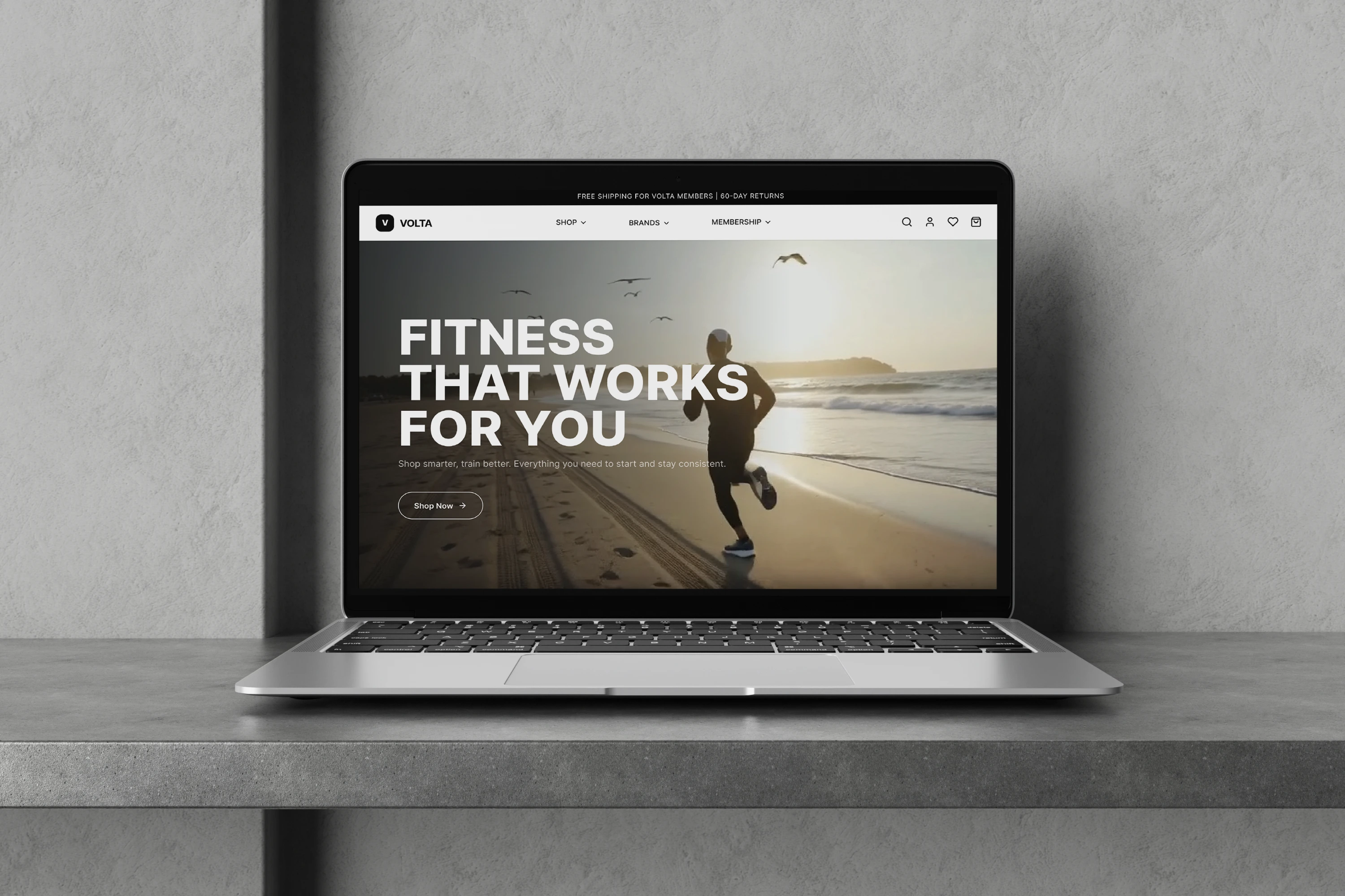
Volta is a multi-brand fitness e-commerce store with apparel, equipment, and wearables, sold entirely online. No physical shops, no fitting rooms, no staff to ask. Everything a customer needs to feel confident enough to buy has to come from the website itself. That single constraint shaped every decision in the project: when a user can't try on the leggings or hold the suspension trainer, the design has to do the work the store would.
Every screen was designed and built from scratch in Figma -- no templates, no UI kits -- as a deliberate challenge to own every detail of the experience, from the smallest component to the full purchase flow.
User Research
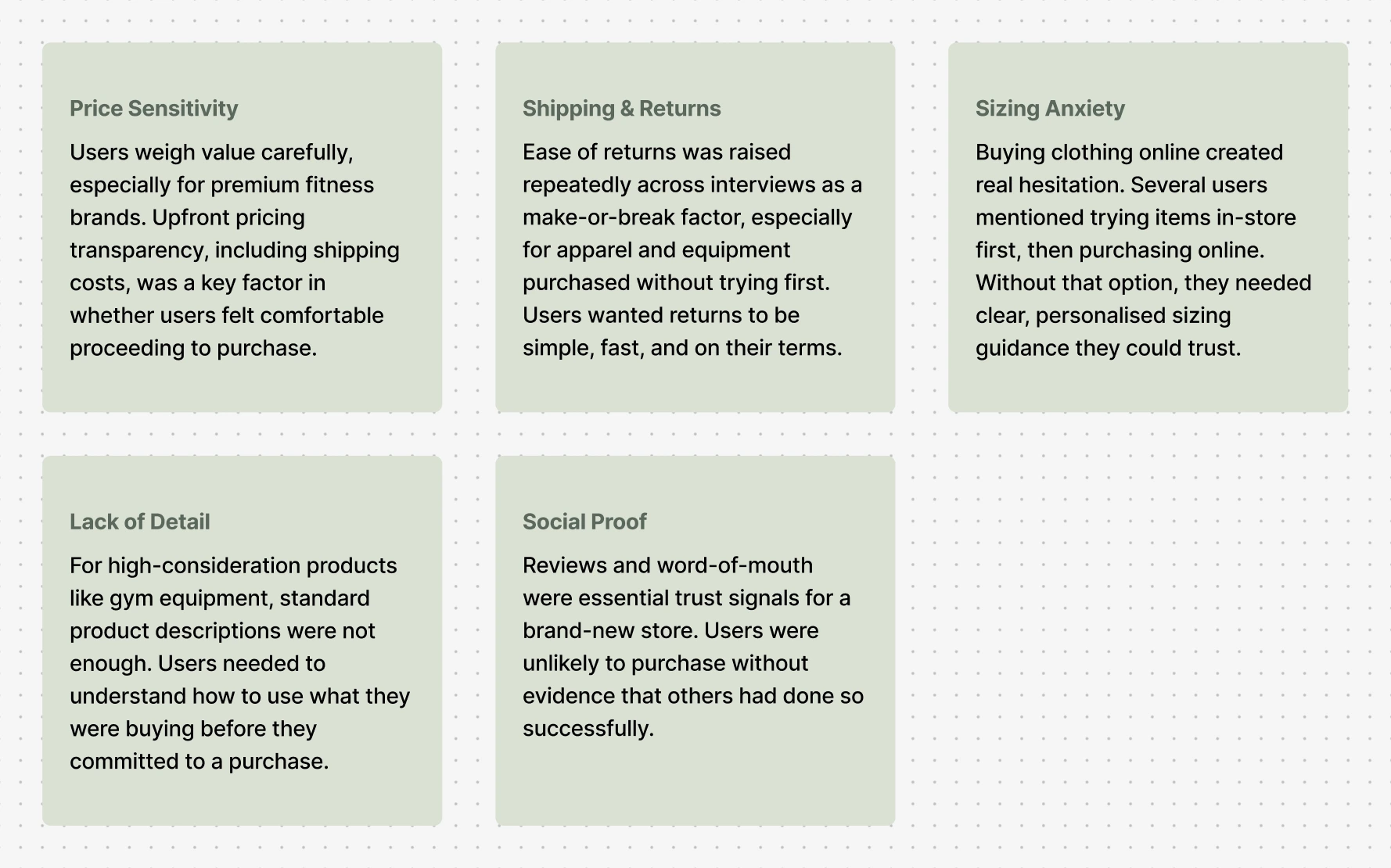
Before designing anything, competitor sites were studied to understand the conventions and gaps in existing fitness e-commerce experiences. This was followed by 10 user interviews conducted to surface the real anxieties, habits, and expectations that users bring to online fitness shopping. Five consistent themes emerged and each one went on to shape a specific design decision in Volta.
The interviews pointed to a single underlying problem: without a physical store, every doubt a shopper might have had to be resolved on screen. That led me to come up with the question that shaped the entire project.
The Problem Statement
That constraint was the central design challenge from the very beginning. When someone can't try on a pair of leggings, hold a suspension trainer, or ask a staff member which shoe runs small, the product page has to do all of that work. The site had to be informative enough to replace the physical retail experience, without becoming overwhelming.
Design Decisions
Every major feature in Volta can be traced back to something users said in research. The following decisions were made deliberately in response to what the interviews revealed.
Sizing anxiety was one of the most consistent themes across interviews. Users described a familiar workaround: visiting a physical store to try something on, then purchasing online. Without a store, Volta had to give users an equivalent level of confidence through the screen alone.
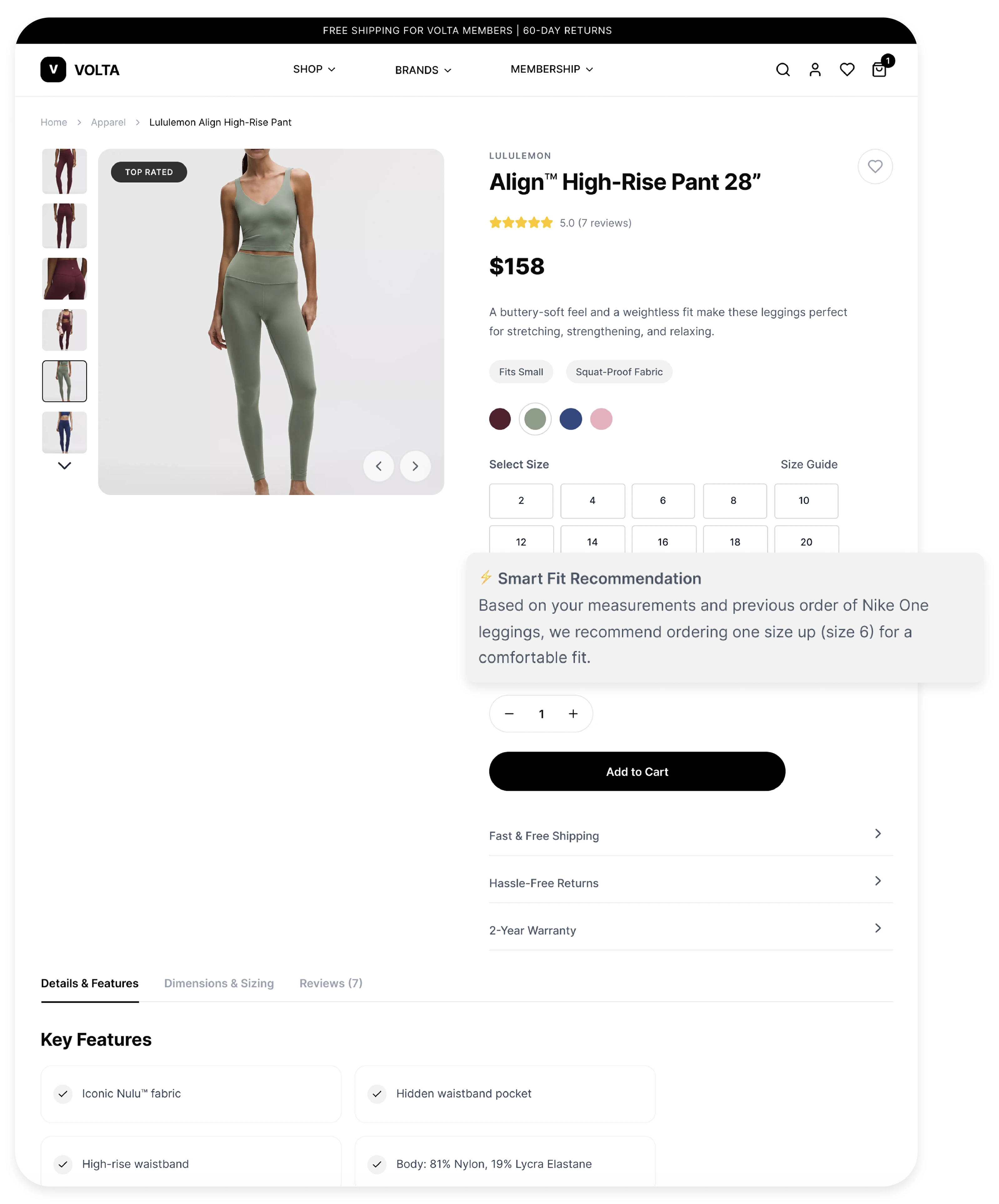
Smart Fit was introduced as a direct response to this. Rather than asking users to measure themselves or decode a generic size chart, this feature draws on information they have already provided — body measurements stored in their profile, and their previous purchase history on Volta. If a user has previously bought a pair of Nike shoes and the fit was true to size, Smart Fit can use that reference point to make a sizing suggestion for a different pair of shoes they are considering. The goal was to make sizing feel personal and reliable, not generic and guesswork-dependent.
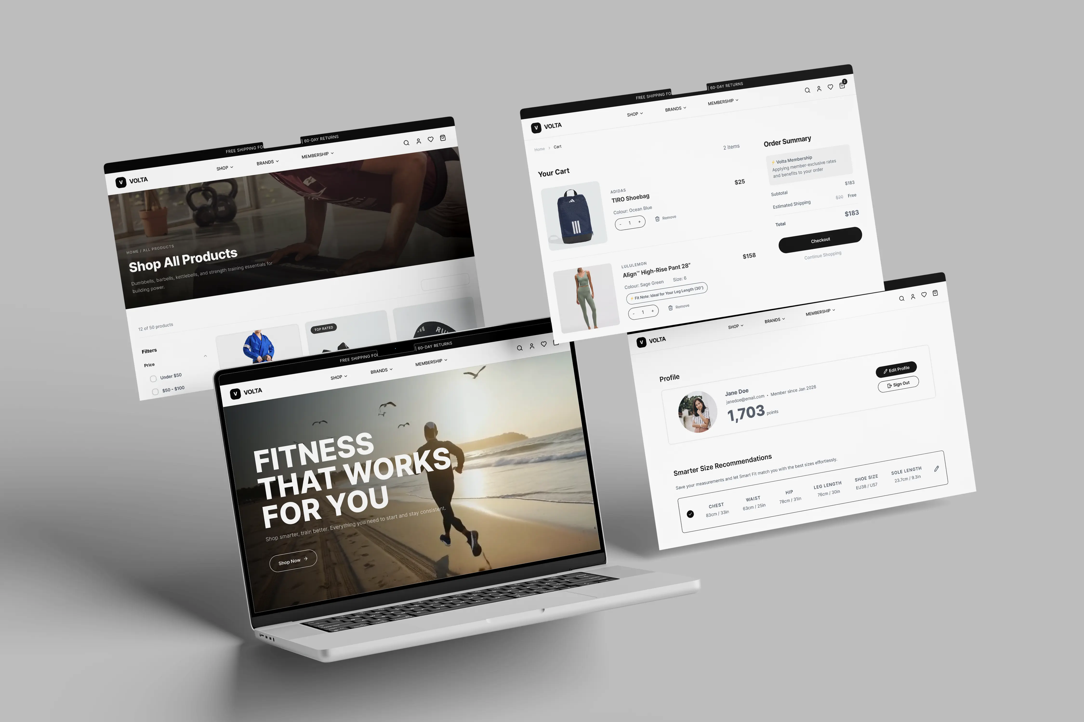
Without a physical store, the product page carries an unusually heavy burden. It has to answer every question a user might otherwise ask a staff member or resolve by simply picking up the item. The product pages in Volta were designed with this in mind. Information density was deliberately high, but structured so it never felt overwhelming.
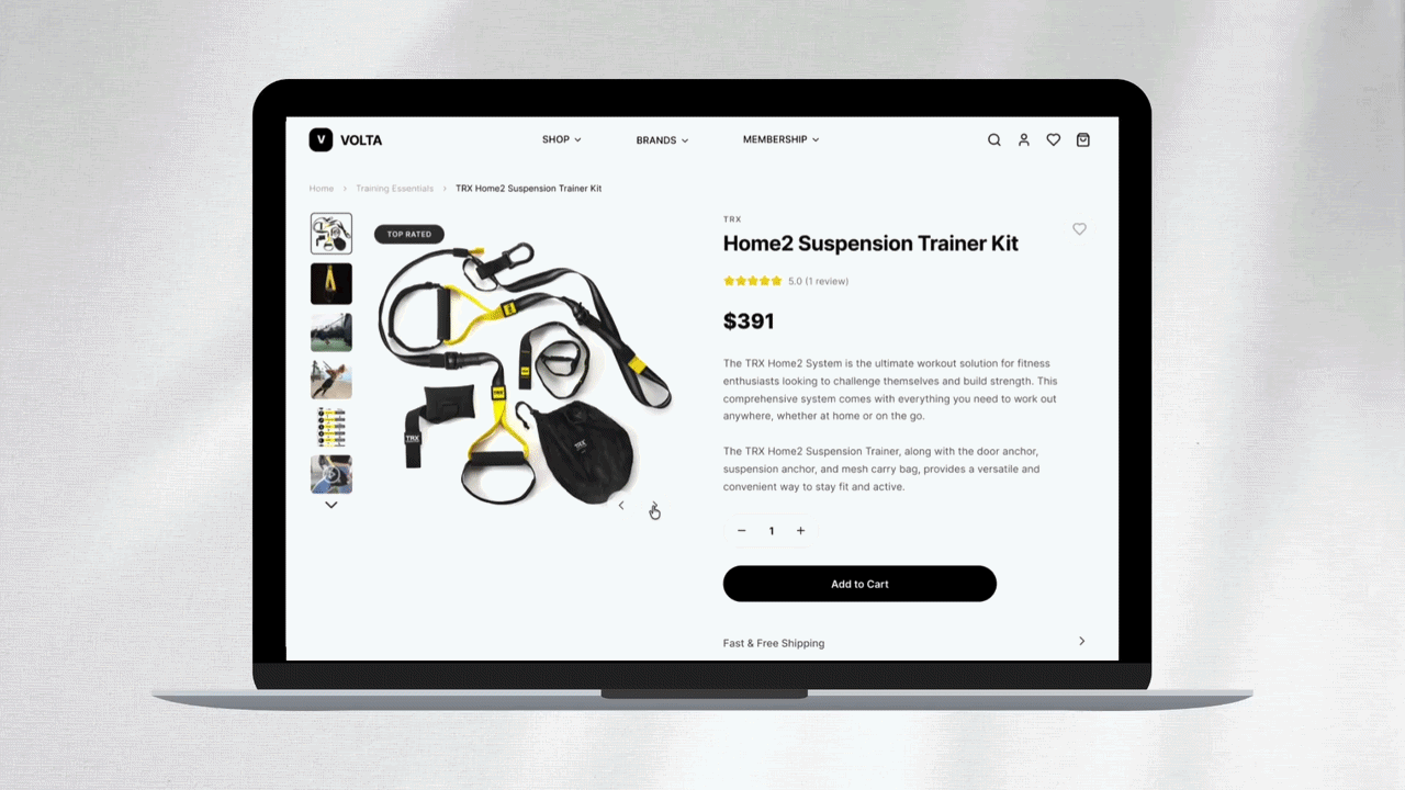
Each product page includes a detailed description, multiple product images, a reviews section for social proof, and a care and maintenance section so users understand how to look after what they are buying. For equipment, this extended further: product videos were included so users could see the item in use, and a dedicated Installation tab was added to house setup guides and installation videos. Buying a suspension trainer online is a considered decision and the product page needed to give users full confidence in not just whether to buy, but how to use it once it arrived.
Ease of returns came up repeatedly in interviews as a deciding factor for online purchases. Users weren't just asking for a returns policy, they were asking for a process that wouldn't punish them for buying something that didn't work out. The standard return process of taking items to a drop-off point was a friction point many mentioned.
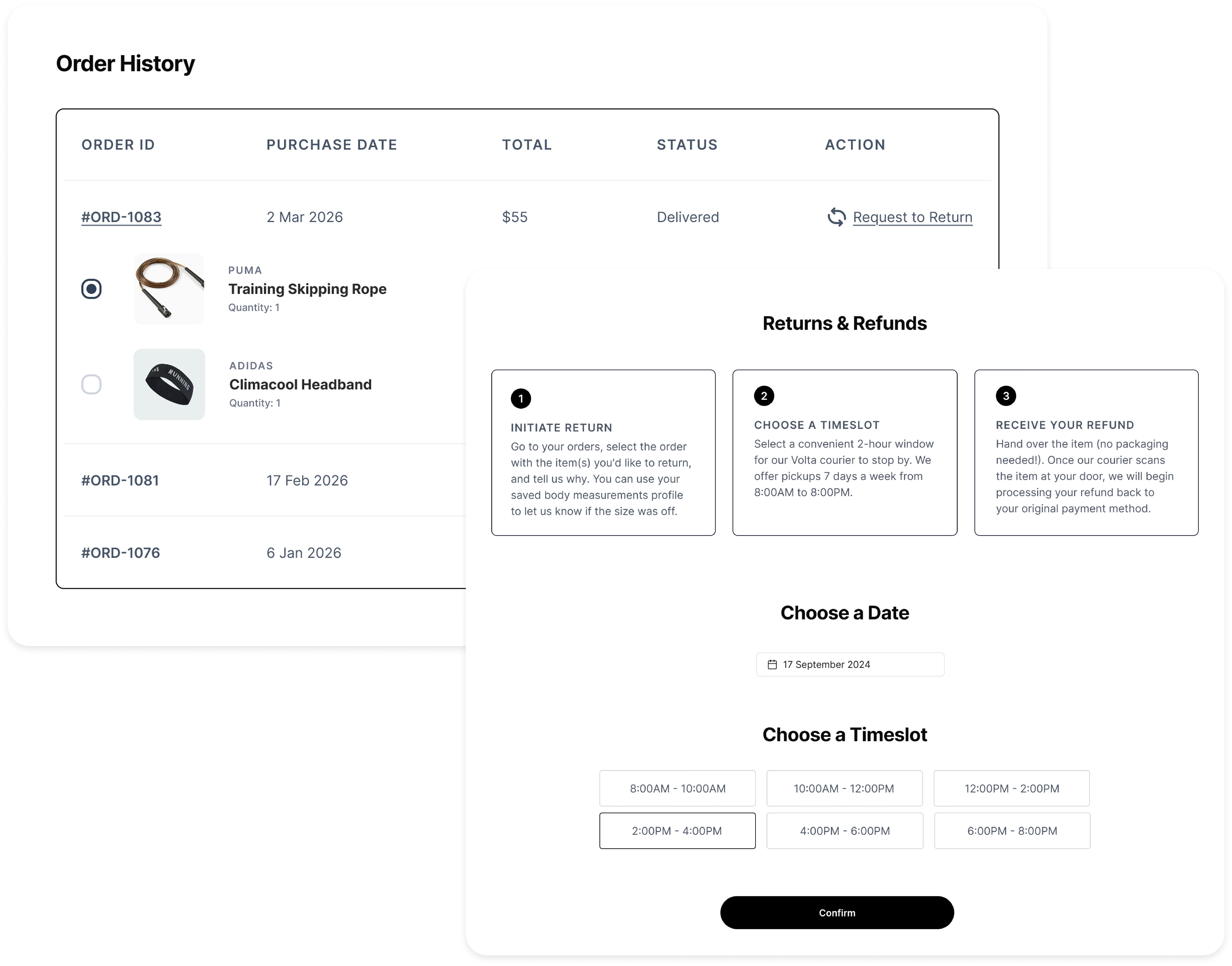
Volta's returns flow was designed to be doorstep-first. Users initiate a return from their order history, select the items they want to send back, and schedule a pickup time. A Volta courier collects the item directly from their address. No packing required, no trip to a drop-off point. The number of steps was also reduced significantly from the initial design, from four steps down to two, ensuring the process matched the simplicity users had asked for.
Usability Test
Five tasks tested the core journeys – browsing, sizing, checkout, returns, and understanding equipment. Four passed cleanly. The two that didn't were the most instructive.
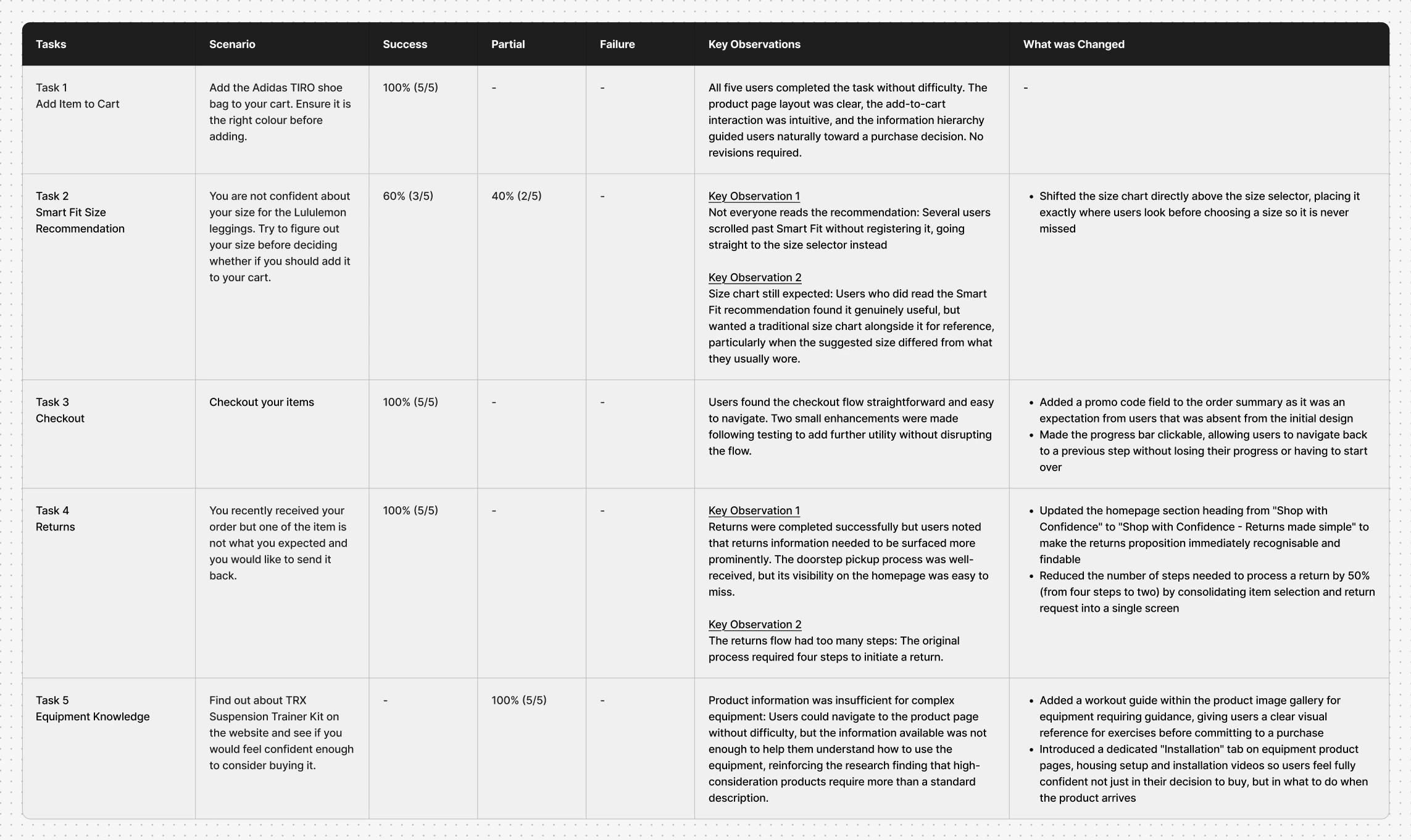
Several scrolled straight past the recommendation to the size selector. The feature was valuable to those who found it; the problem was visibility.
The fix was placement: a prominent 'Size Guide' link was added directly above the size selector, exactly where users look before choosing, along with a size chart pop-up for those who wanted to compare.
Users could find a product like the TRX suspension trainer, but the page didn't give them enough to understand how to actually use it, echoing the exact research finding that high-consideration equipment needs more than a description.
This led to two additions: a workout guide within the product gallery, and a dedicated "Installation" tab housing setup videos, so users felt confident not just buying the equipment but living with it afterward.
Conclusion
Volta was built on a single principle: if the store exists only online, the design has to close every gap that a physical store would otherwise fill. That meant approaching each screen not as a layout problem, but as an information problem — what does this user need to know, right here, to feel confident enough to move forward?
The research made those gaps concrete. Sizing anxiety led to Smart Fit. The demand for easy returns led to a doorstep pickup flow and a streamlined two-step process. The need for product depth led to installation guides, workout references, and care and maintenance information. The need for trust led to a reviews system and transparent pricing throughout. Each feature has a direct correlation back to something a user said.
The usability results showed that approach paid off: a 2 out of 7 ease-of-use score and four out of five tasks completed successfully on first test confirmed that the design was intuitive, the information architecture was sound, and Volta was a store users could navigate and trust from the very first visit.