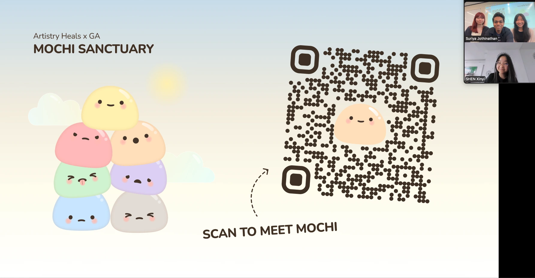
Mochi Sanctuary
Industry
Mental Health
Client
Artistry Heals
Duration
3 Weeks
Team
Sherlyn, Jiayi and Suriya
Industry
Mental Health
Client
Artistry Heals
Duration
3 Weeks
Team
Sherlyn, Jiayi and Suriya
Our Process
Artistry Heals, an organisation focused on creative and emotional wellbeing, came to the team with an existing prototype of Mochi Sanctuary – a gamified wellness companion app they had already built. The brief was to evaluate it through the eyes of real users, understand what was working and what wasn't, and deliver a meaningfully improved iteration. What followed was a six-stage process where each stage built directly on what the previous one uncovered.
Stage 1 – User Interviews & Usability Test 1 (Client's Prototype)
Before forming any opinions about the existing prototype, 10 in-depth user interviews were conducted with participants aged 22 – 29. The goal wasn't to evaluate the app yet. It was to understand how young adults approach emotional wellness in the first place, what makes them stick with an app, and what causes them to quietly stop opening it.
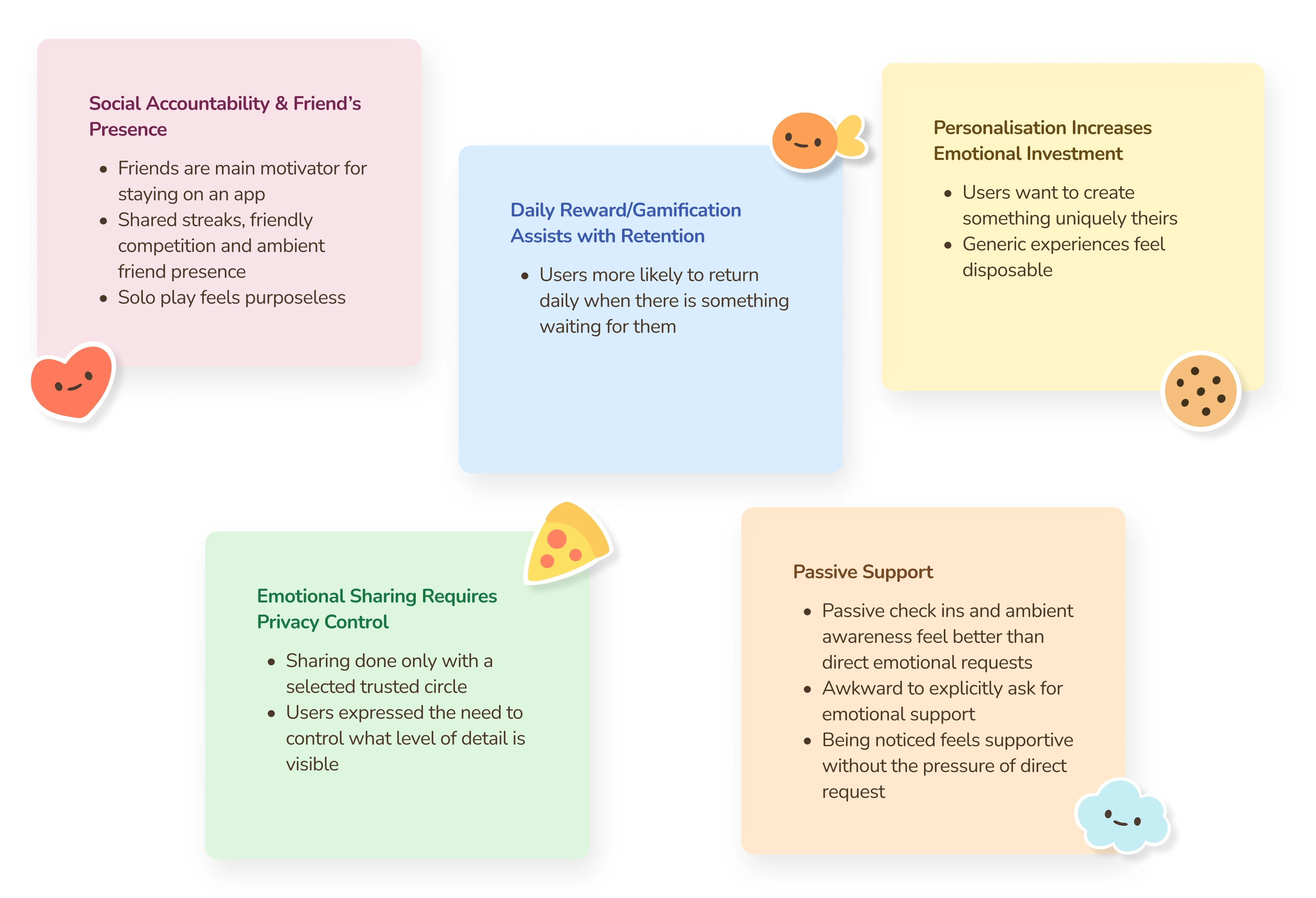
These five themes didn't just describe user preferences, they formed a framework for evaluating every feature in the existing prototype. Any feature that aligned with these needs had potential. Any feature that worked against them would need to be rethought.
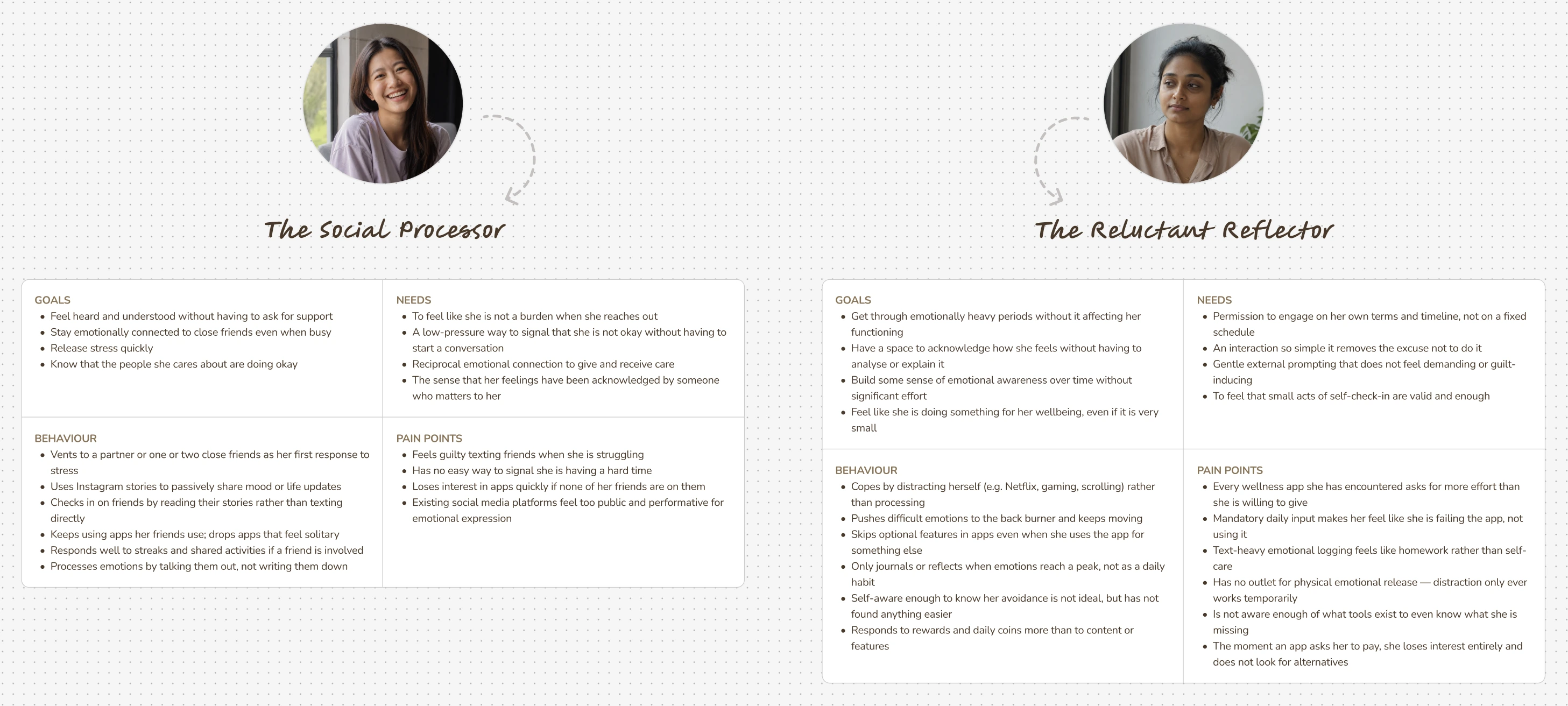
The interview findings crystallised into two user archetypes. What made them useful wasn't just the demographic detail, it was the tension between them. The Social Processor needed the app to feel connected. The Reluctant Reflector needed it to feel effortless. The redesign had to serve both without compromising either.
The Problem Statement
With the research complete and the personas defined, the problem space narrowed into four specific questions. These weren't hypothetical — each one mapped directly to a gap the interviews had surfaced, and each one would later be answered by a specific feature in the redesign.
With a clear understanding of what users needed from a mental wellness app, the next step was to see how the client's existing prototype measured up. The same 10 interview participants were given four tasks. The concept was strong but specific execution decisions were creating consistent friction across the board.
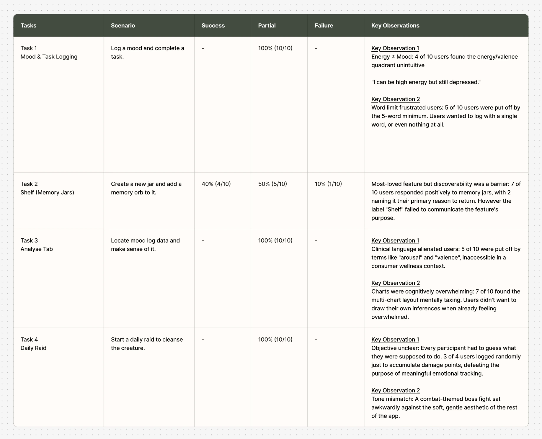
The usability test confirmed what the interviews had hinted at: the ideas behind the prototype were sound, but the experience wasn't matching the intent. To understand whether these patterns held up beyond a controlled test, the team needed to see how the app performed in daily life, over time, not in a single sitting.
Stage 2 – 7-Day Beta Test (Client's Prototype)
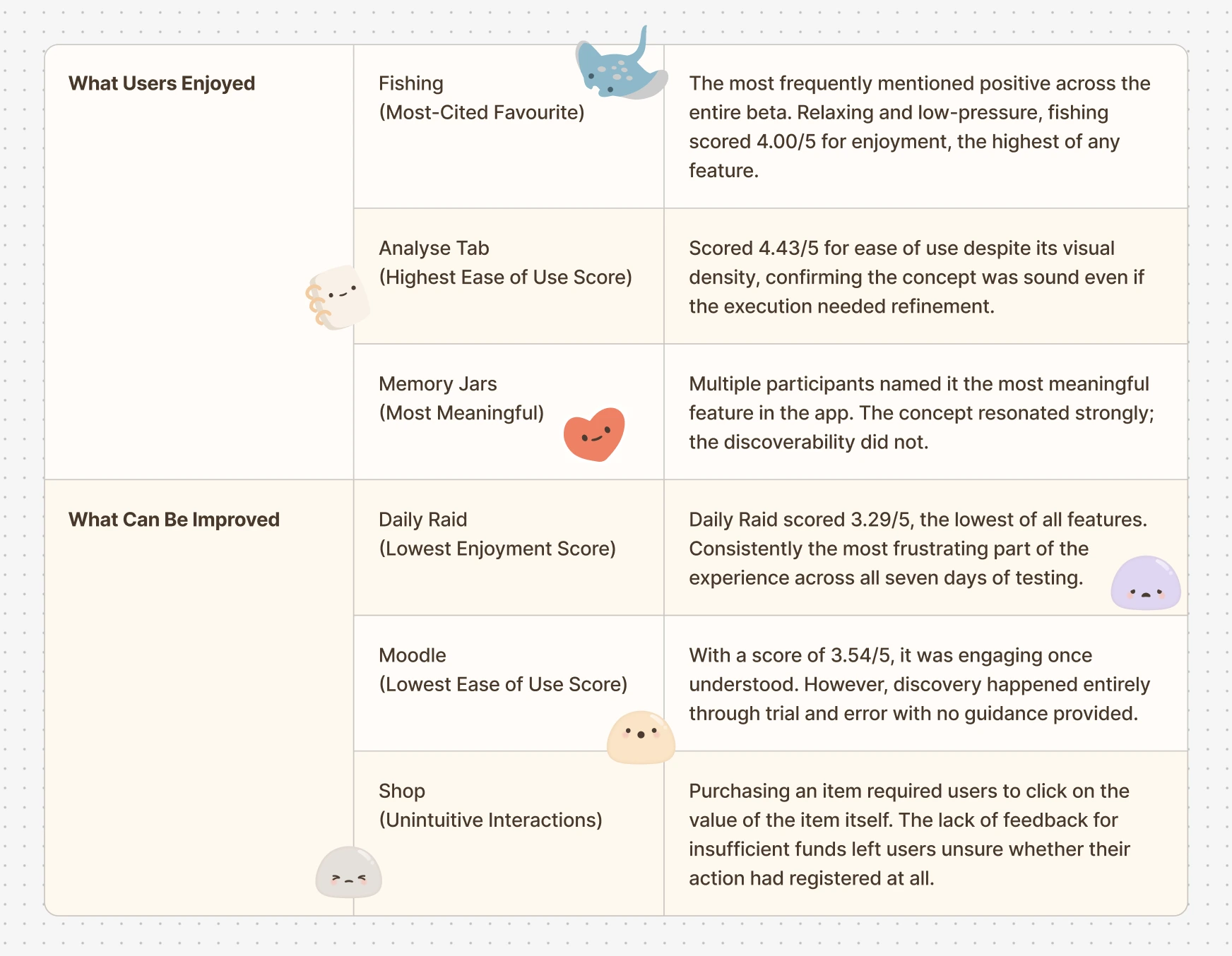
A usability test captures first impressions. A beta test captures what happens after the novelty wears off. 28 participants aged 18 – 29 used the existing prototype in their daily lives for a full week, generating 167 total responses. The question wasn't just whether users could complete tasks, it was whether they would want to keep coming back.
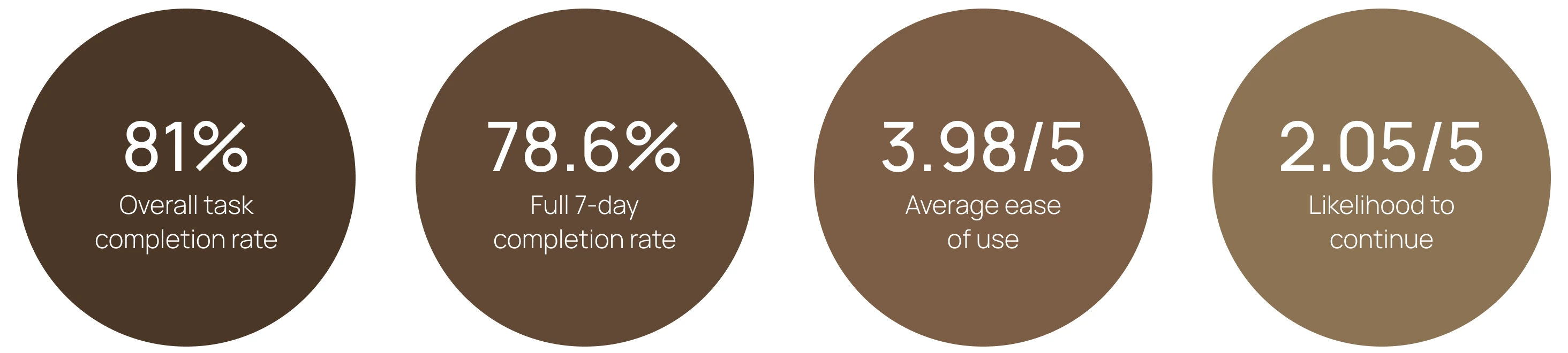
The numbers told a clear story. An 81% task completion rate showed the app was functional. But the 2.05/5 likelihood-to-continue score revealed something the usability test couldn't: the prototype was usable, but not yet something people would choose to keep in their lives. That gap between functional and meaningful became the target for the redesign.
The beta made the scope of the redesign clear. It wasn't about fixing isolated usability issues. It was about rethinking the features that weren't earning their place, while preserving and strengthening the ones users had genuinely connected with.
Stage 3 – Designing the New Prototype
The redesign was not a visual refresh. It was a systematic response to what the research, usability testing, and beta had collectively surfaced. Every feature that changed did so for a documented reason and the features that stayed were the ones users had specifically championed.
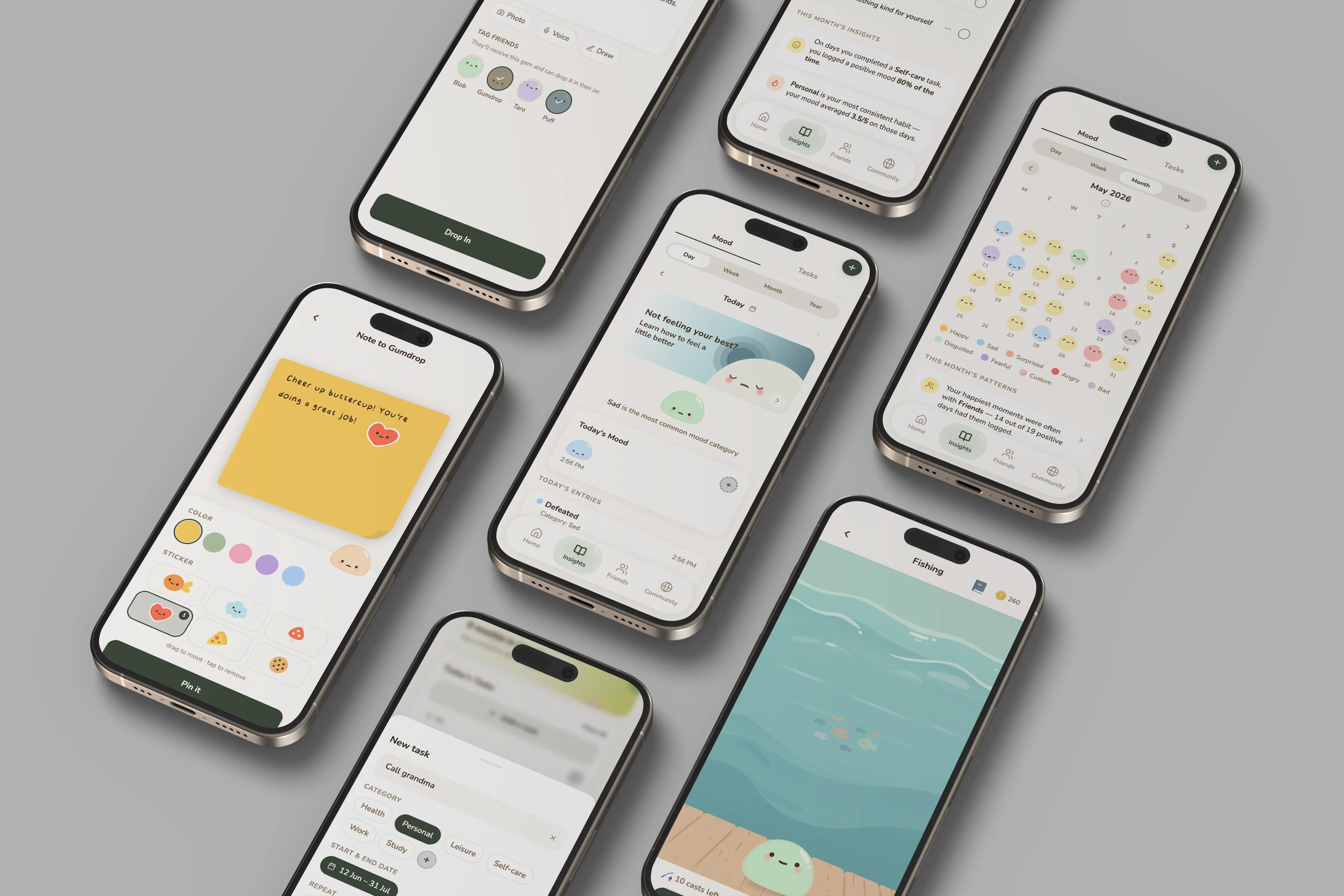
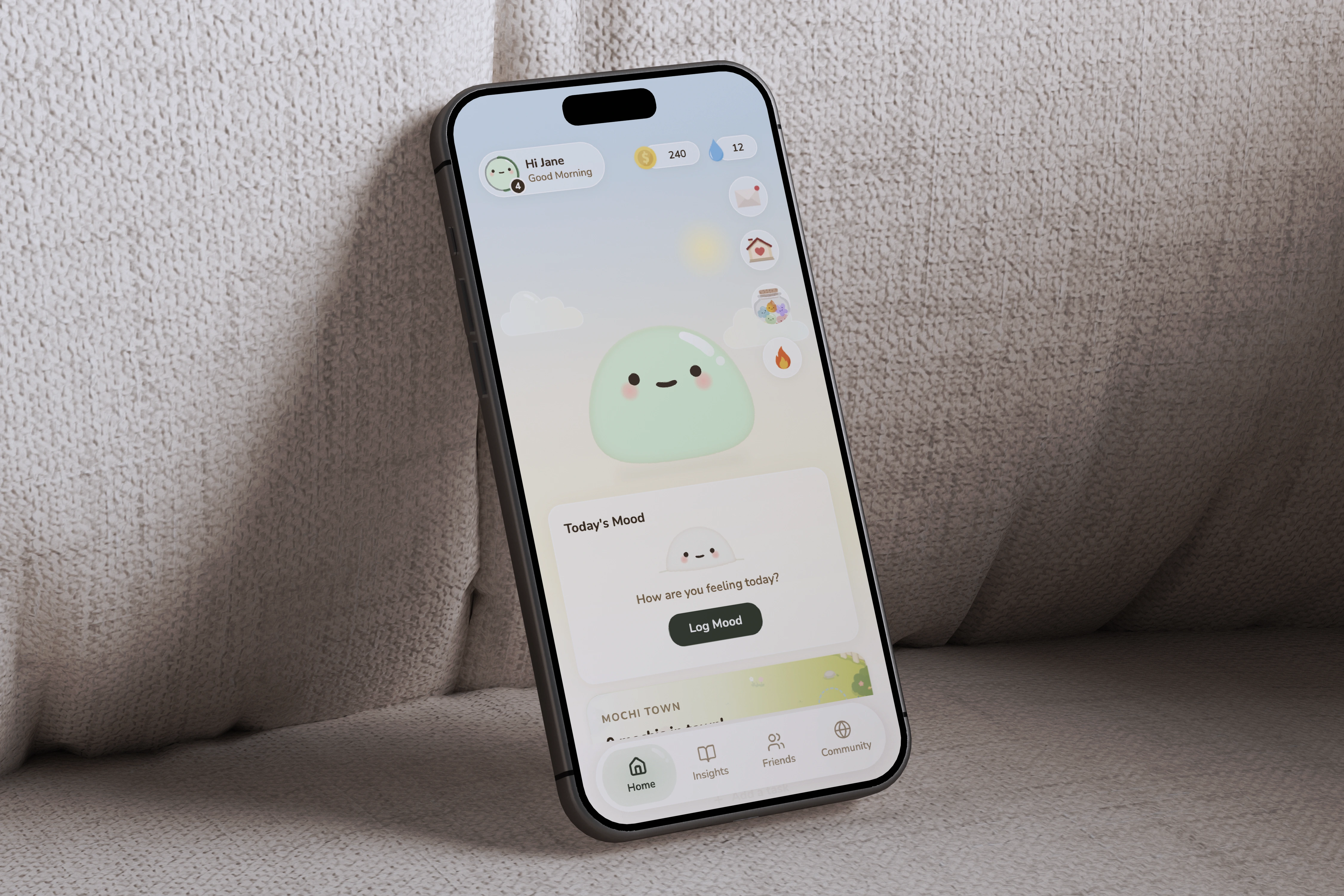
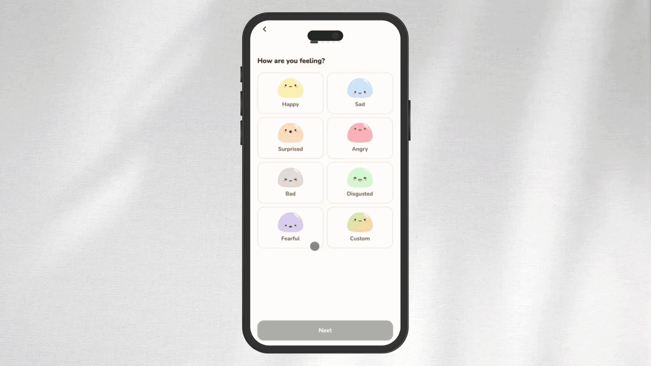
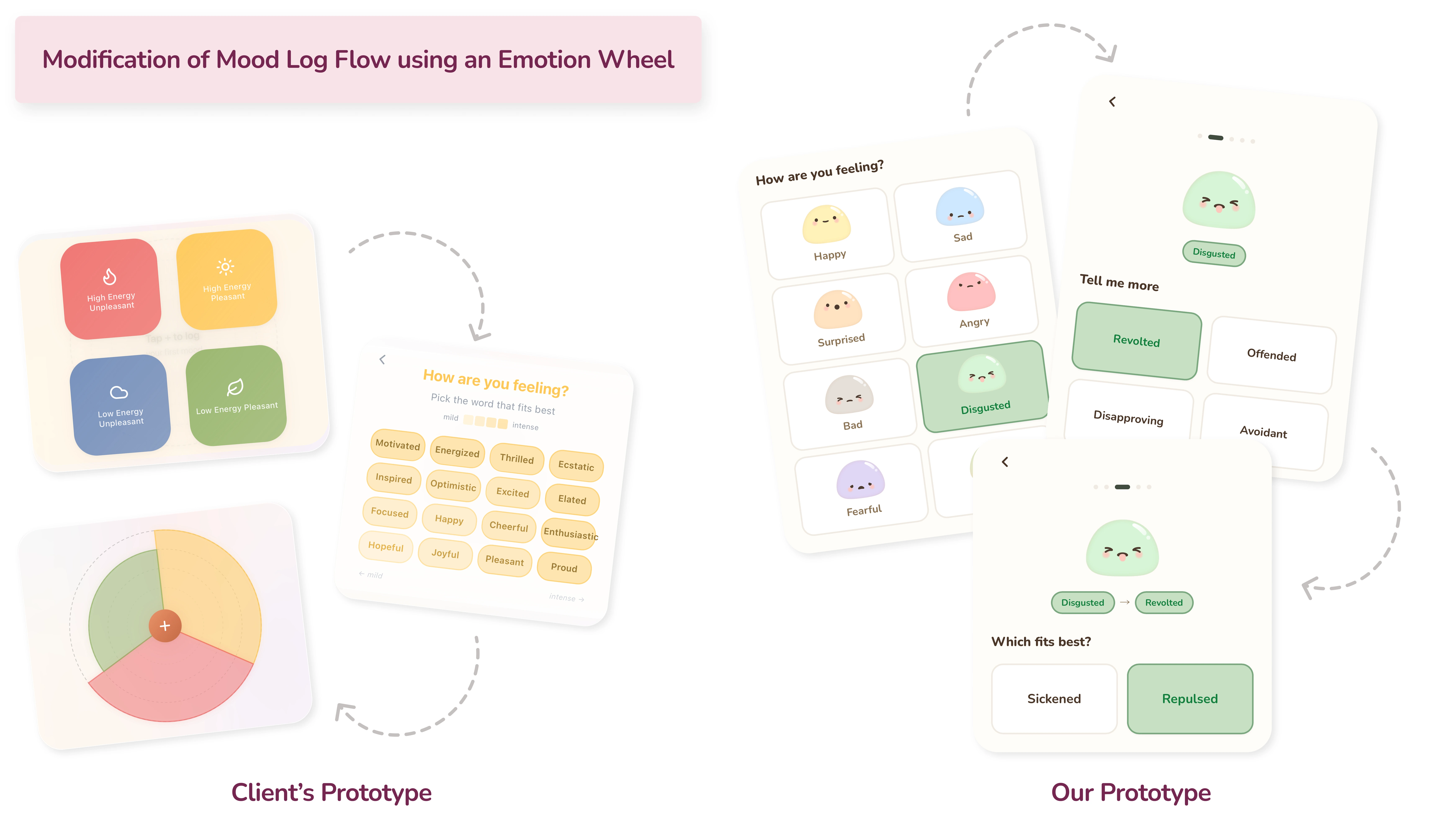
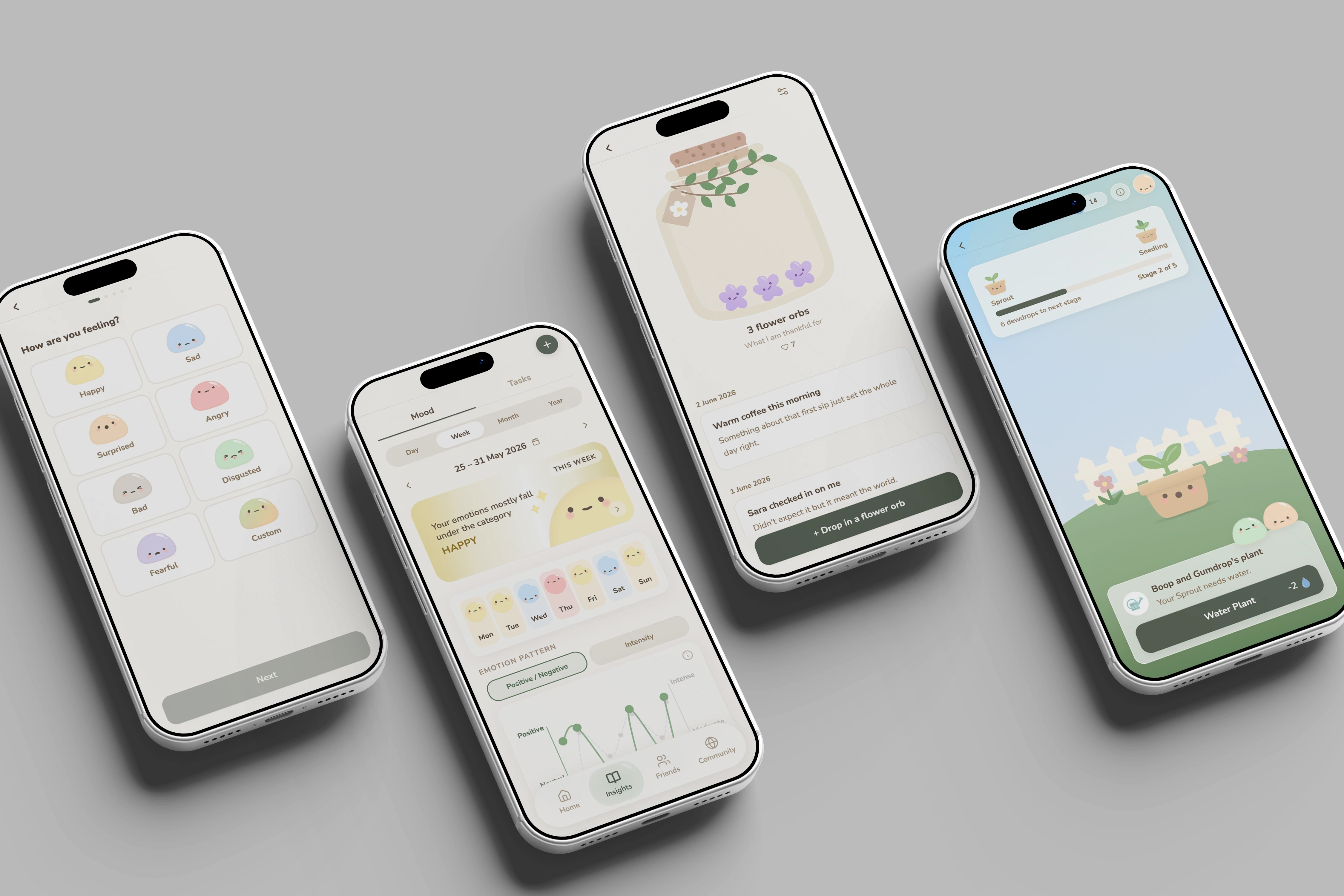
The existing prototype used a high/low energy and pleasant/unpleasant quadrant to capture mood. In testing, 4 out of 10 users found this unintuitive — energy and mood felt like two different things. Replacing it with an emotion wheel made it easier for users to log how they're feeling, while also helping those who struggle to pinpoint their emotions navigate from broader categories down to more specific ones.
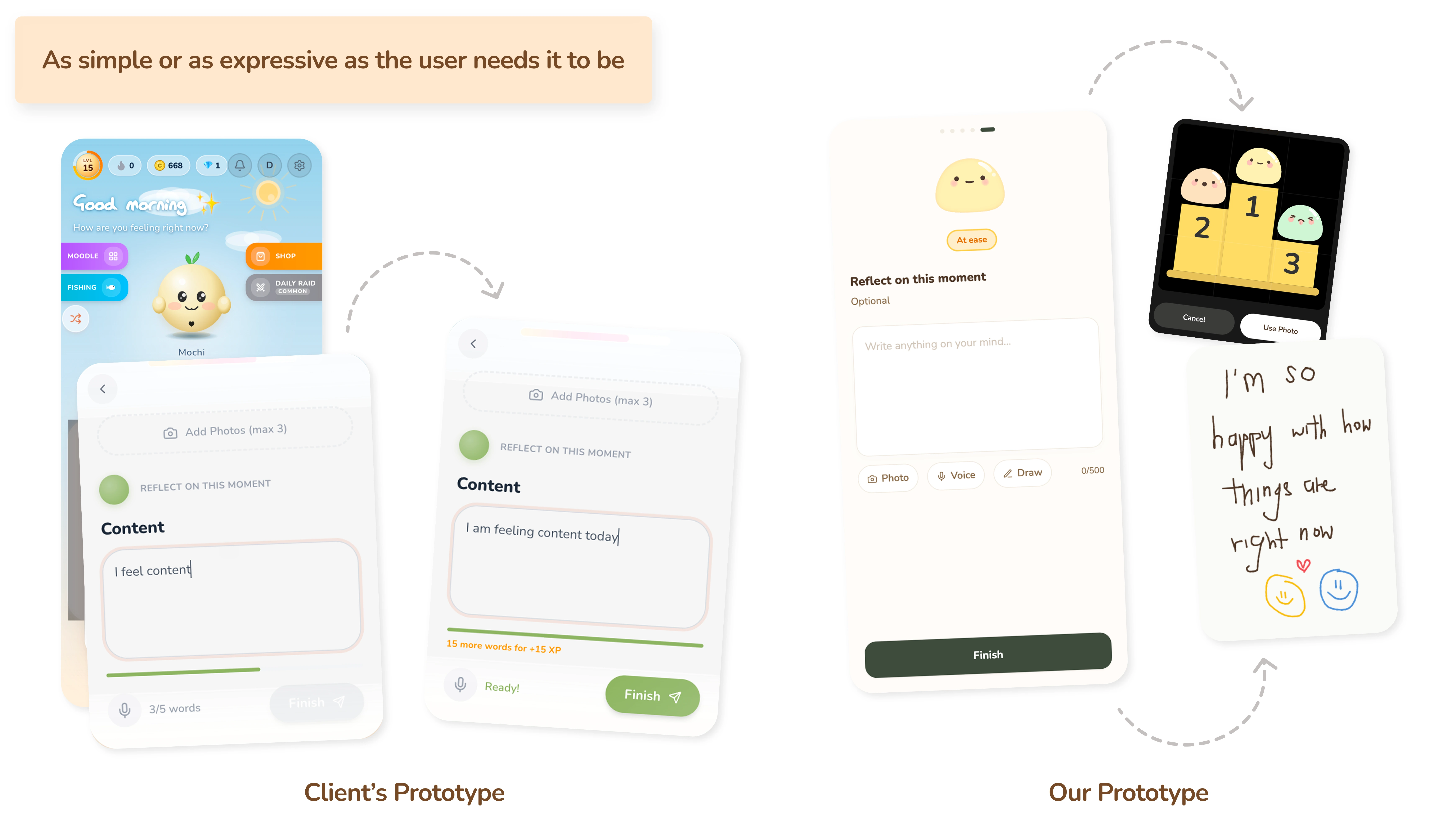
The existing prototype required a minimum of 5 words to log a mood — a restriction that frustrated half of all test participants. For a mental wellness app, forcing users to articulate their feelings before they can move on works against the very thing it's trying to encourage.
The 5-word minimum was removed entirely. Users can now choose how they want to express themselves, whether that's typing a reflection, uploading a photo, recording a voice memo, or even drawing. All optional, all on their own terms.
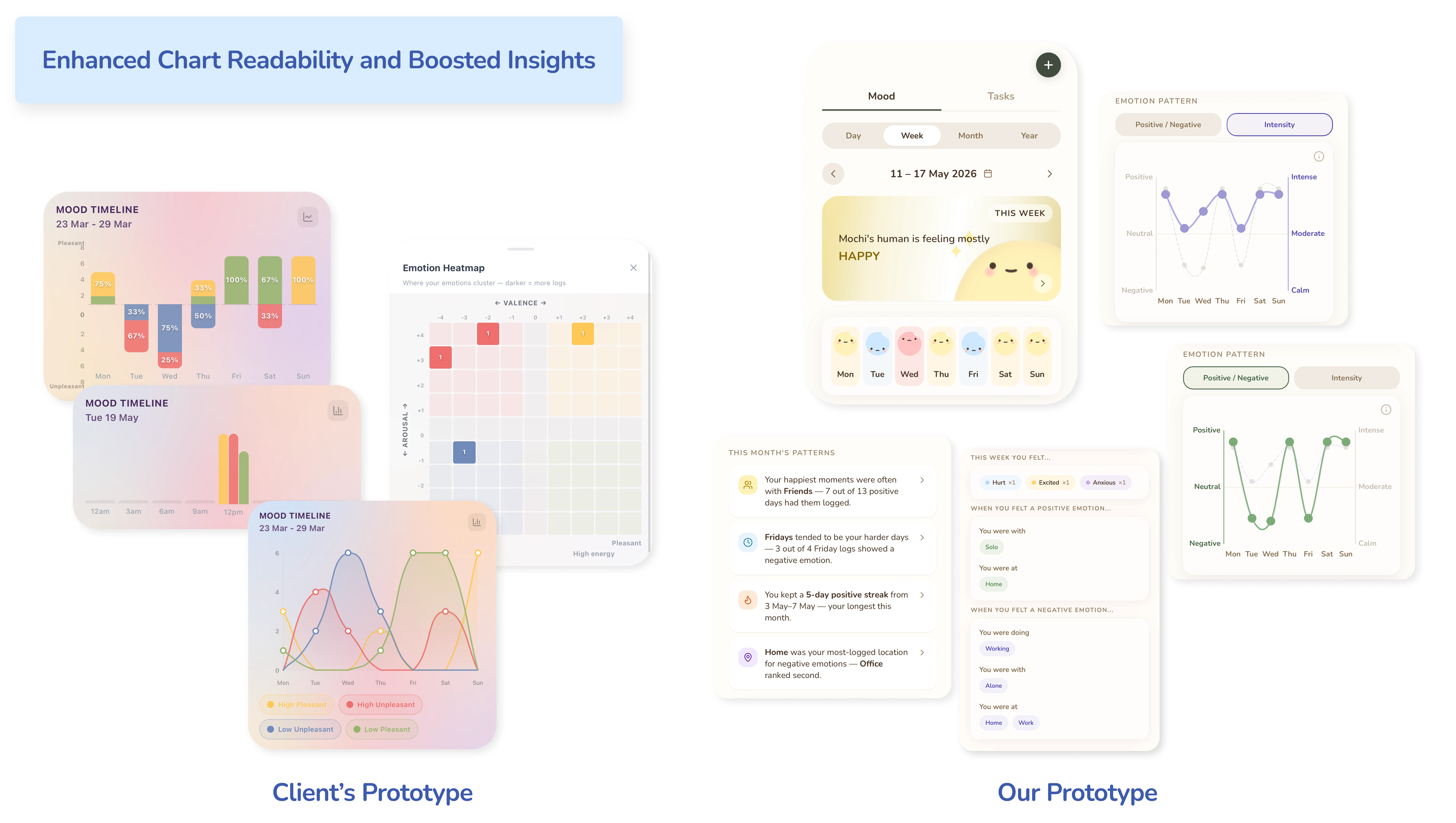
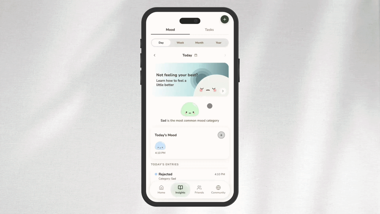
The existing Analyse tab scored well for ease of use in the beta (4.43/5), confirming the concept was valued. But in usability testing, terms like "arousal" and "valence" alienated users, and the multi-chart layout was cognitively overwhelming — the opposite of what a mental wellness app should feel like.
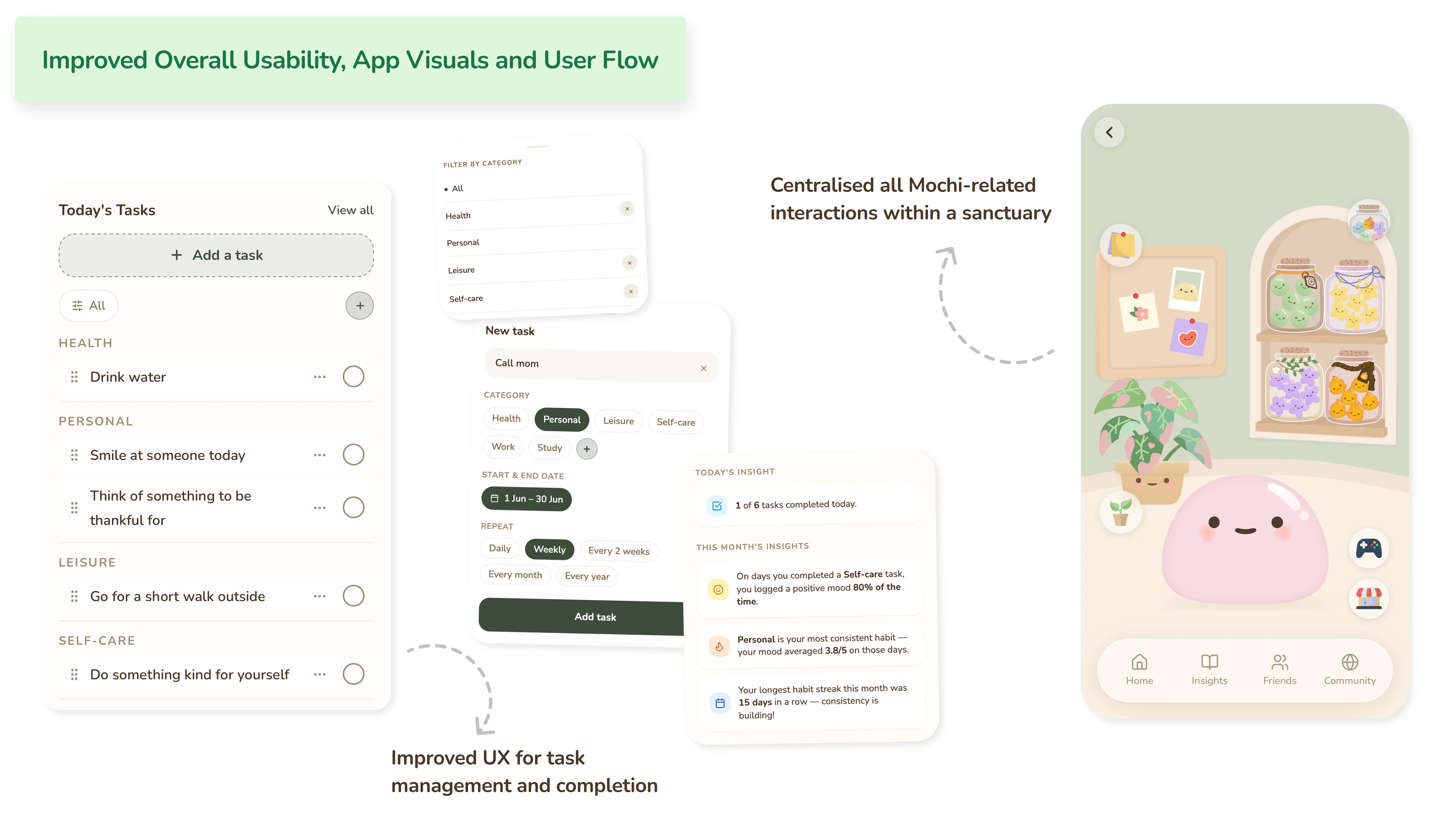
The tab was renamed from "Analyse" to "Insights" to feel less clinical and more inviting, encouraging curiosity and exploration. Charts were simplified and paired with plain-language summaries that interpret the user's emotional patterns and behaviour on their behalf.
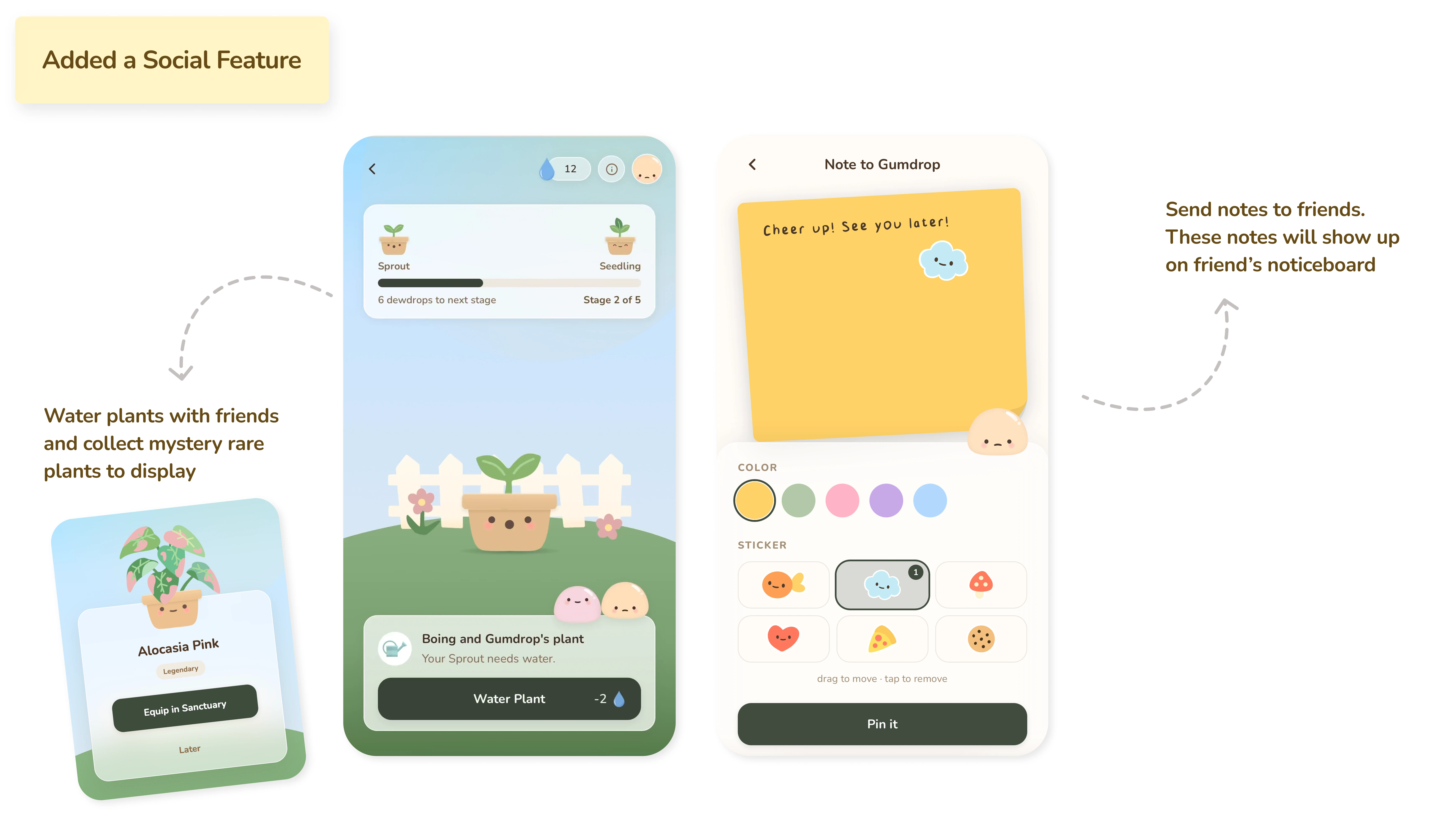
Having friends on the app came up consistently during research as one of the most important reasons users stayed engaged. The shared garden was designed as a direct response to that finding. Users take turns to water shared plants with their friends — a simple shared goal that gives both users a reason to return every day.
Because Mochi reflects the user's logged mood, friends can quietly pick up on how someone is doing and send a small note to check in — a subtle way to stay emotionally connected without having to announce how you are feeling. This feature replaced the Daily Raid entirely, which was tonally mismatched and poorly understood by users.
Beyond the specific feature redesigns, the overall usability, visual language, and user flows were refined to make the app feel like a single cohesive experience rather than a collection of separate tools. Task management was streamlined, reducing unnecessary friction in an interaction users perform daily. All Mochi-related interactions were centralised within a dedicated sanctuary space, making the experience feel more personal and more consistent, deepening the connection between the user and their companion.
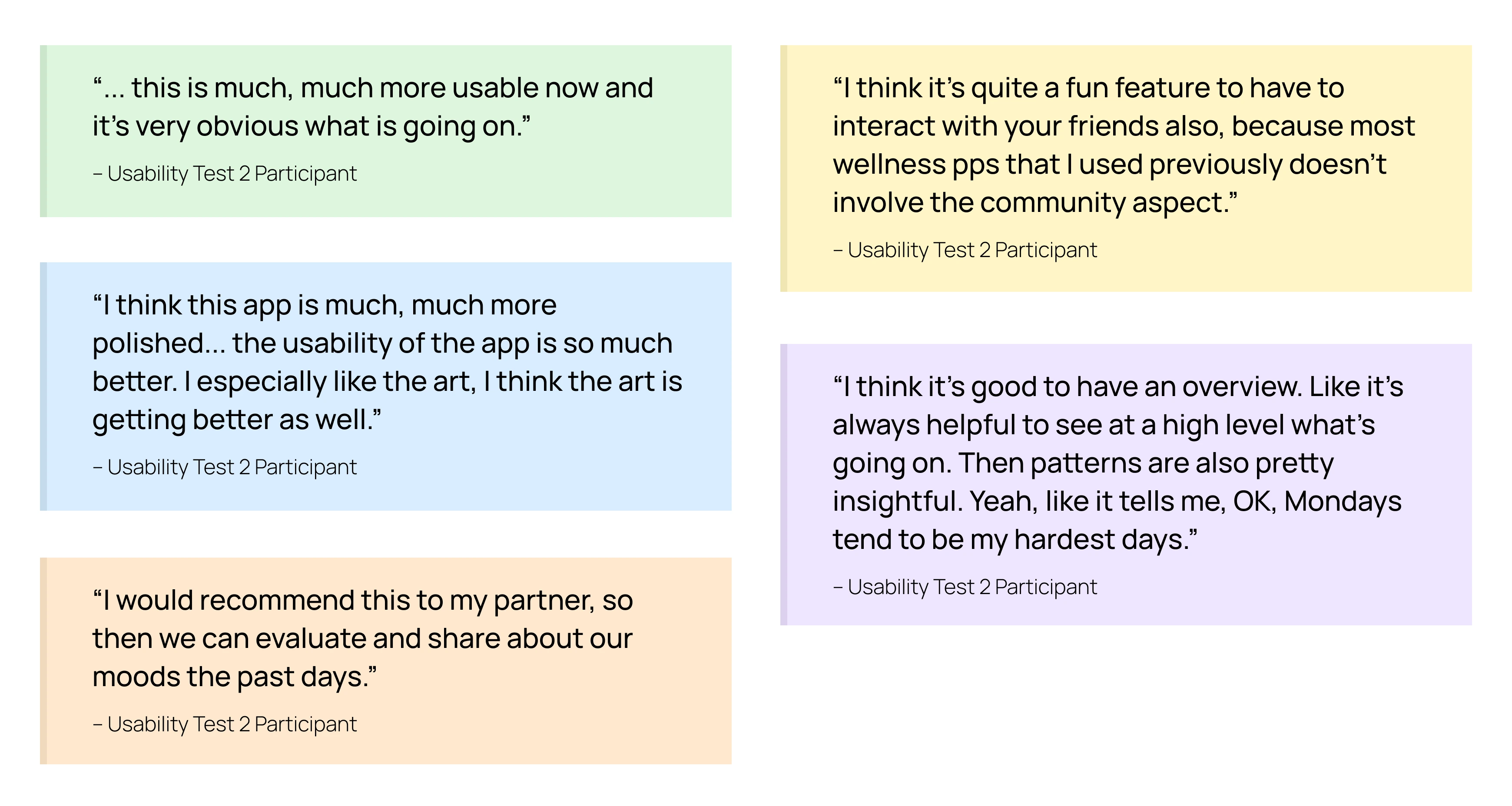
Stage 4 – Usability Test 2 (Our Prototype)
6 participants (a mix of new users and returning beta testers) tested the redesigned prototype. The improvement across every retested task was significant.
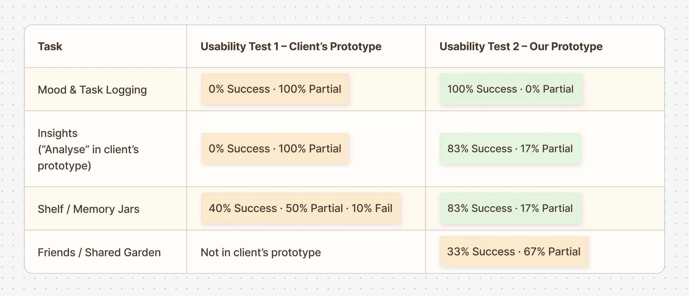
Mood logging went from 0% success to 100%. Memory Jars went from a 10% failure rate to none. The Insights tab, once impenetrable to half of all users, became one of the most positively received features. The Friends feature, tested for the first time, achieved a 33% success rate with 67% partial — revealing that the concept resonated but the mechanics of dew drops and watering still needed clearer onboarding. That finding informed the final round of refinements.
Stage 5 – Expert Interview
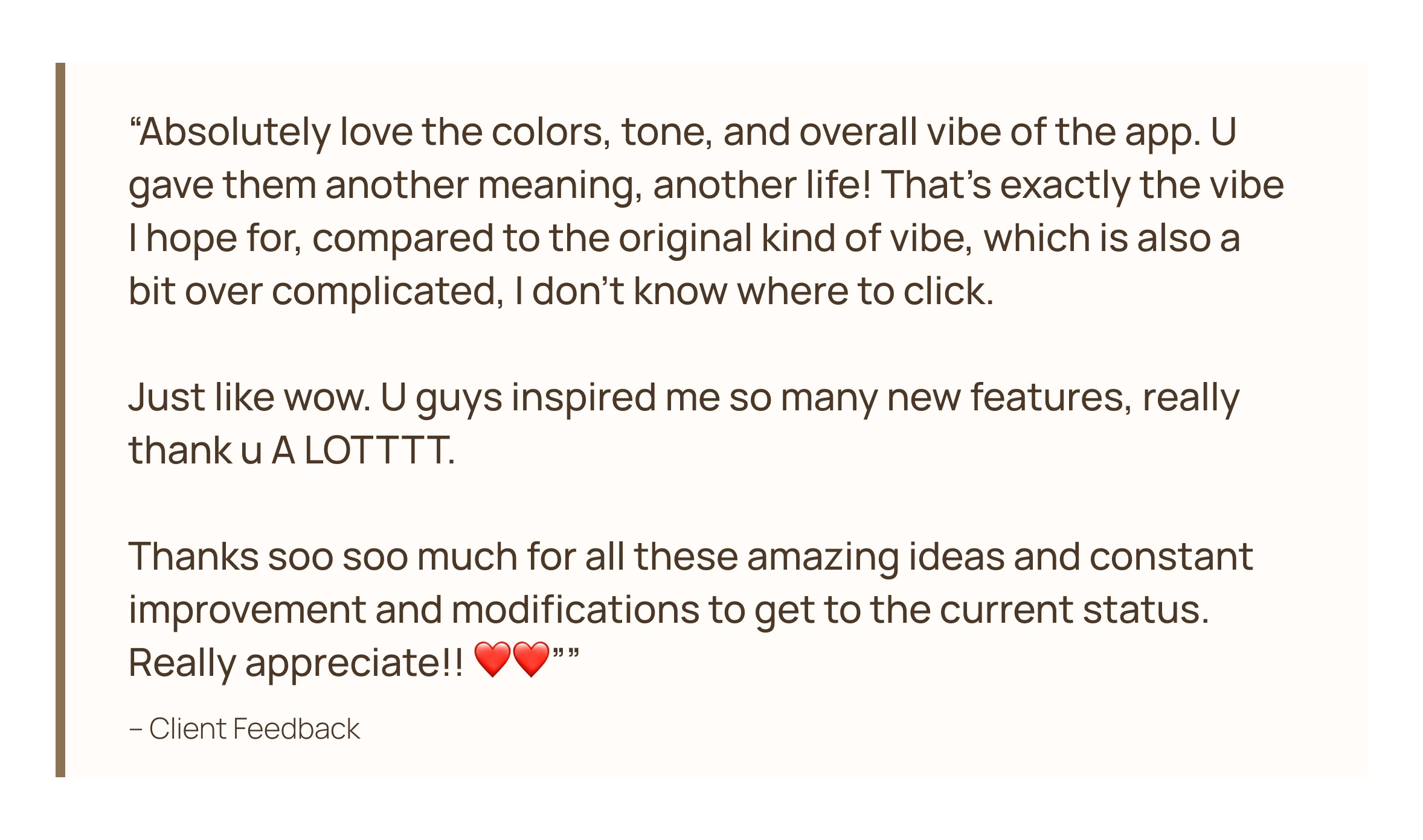
To stress-test the redesign beyond user feedback, Rachna, a practicing psychotherapist, was brought in to review both prototypes side by side (the client's original and our iteration). This wasn't a formality. Having a mental health professional evaluate the emotional model, the language choices, and the interaction patterns gave the team a layer of validation that usability metrics alone couldn't provide. Her response to the redesigned prototype was strongly positive, and her critique of the original helped articulate precisely why the earlier version had struggled.
A recurring gap she highlighted across mental wellness apps is the tendency to focus on surfacing how users feel without helping them do something about it. The emphasis should always be on what users can do to feel a little better, instead of just what they are currently feeling. That observation led directly to the addition of breathing exercises and grounding prompts (tips from Rachna to activate the parasympathetic nervous system) as actionable responses to mood logs in the final design.
Stage 6 – Final Design
The final design was a complete overhaul, rebuilding the experience from the ground up while staying true to the core vision the client's prototype had set out to achieve. Every significant pain point raised by users was addressed, feedback from the psychotherapist was woven into the design decisions, and everything users had genuinely loved about the original was preserved and built upon. The result was an app that felt entirely new in its execution, yet grounded in everything the original set out to be.