Medication Reminders
Industry
Healthcare
Client
HealthHub
Duration
2 Weeks
Team
Sherlyn, Rowan and Mirin
Industry
Healthcare
Client
HealthHub
Duration
2 Weeks
Team
Sherlyn, Rowan and Mirin
Overview
HealthHub is Singapore's national health app — a powerful platform that holds a wealth of personal medical information: appointment history, lab results, and prescription records. Yet for most users, the interaction was frustratingly thin. They would open the app to book an appointment, secure their slot, and not return until the next visit.
This pattern revealed a missed opportunity. HealthHub had everything it needed to be a meaningful daily companion for health, but none of the touchpoints to make that happen.
The challenge was to find a way to make HealthHub more relevant to users beyond their next appointment and to identify and design a feature that would add genuine value to their lives. However, we didn't start with a solution in mind. The feature had to be earned through research and it was the users themselves who pointed the way.
Research & Discovery
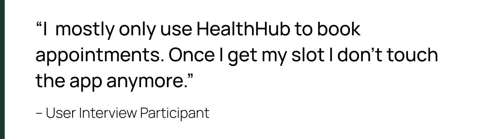
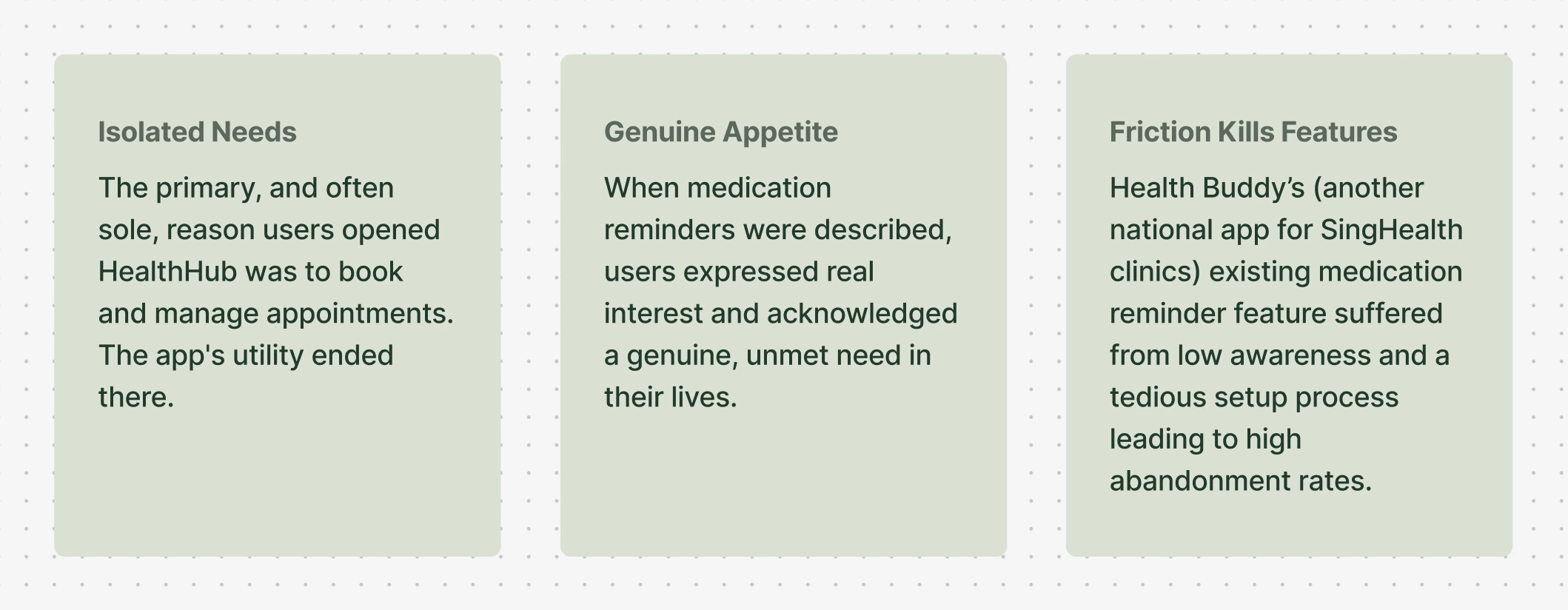
To ground the work in real behaviour, the team conducted 15 user interviews across two groups: young adults (mid-20s to 30s) and seniors (50s to 70s). The interviews began broadly – exploring how users currently interacted with HealthHub and where they felt it fell short. One topic, however, stood out consistently across every conversation.
When medication reminders was raised in interviews, the reaction was immediate and enthusiastic. Users didn't just acknowledge it as a useful idea, they expressed a genuine, felt need. Many described the friction of managing medications in their daily lives and were visibly excited at the prospect of the app handling it for them.
But the enthusiasm came with an important caveat. When users were pointed to Health Buddy's existing medication reminder feature, a comparable product already on the market, the experience told a different story. The setup was tedious, the flow was confusing, and the amount of information required upfront was overwhelming. The result was a high abandonment rate: users would start the setup process and give up before completing it. The appetite was real but the existing solution just wasn't good enough.
What made this finding particularly compelling was the workarounds users had already built for themselves. Without a reliable in-app solution, people were getting by however they could – relying on memory, setting generic phone alarms, keeping physical pill boxes, or writing reminders on pen and paper. These were not elegant solutions, but they were the best available.
.webp)
This was the moment the feature direction became clear. It wasn't just that medication reminders would be convenient, it would meaningfully reduce the mental load of something they were already doing every single day. HealthHub already held the prescription data. The opportunity was to put it to work.
Three things were now clear: users wanted this, the existing solutions had failed them, and HealthHub was uniquely positioned to do it better. The problem could finally be framed.
The Problem Statement
The research crystallised into a clear persona and problem statement. "The Proactive Patient" takes their health seriously. They manage their own medications and are diligent about taking them on time. But they are doing so using workarounds, to replicate information that HealthHub already stores.
Despite using HealthHub for appointments, they find no further use for it in daily life. "The Proactive Patient" wasn't underserved because HealthHub lacked the data. It was underserved because that data was sitting idle while they did the work manually. That tension is what the feature had to resolve.
The Solution
The solution was not to build another generic reminder app. It was to leverage HealthHub's existing prescription data to remove the friction of setup entirely, and reduce the mental load users carry daily just to stay on top of their medications.
The research had been clear about why the existing solutions failed: they demanded too much, too early. Health Buddy's abandonment problem wasn't a missing feature, it was friction. So the guiding decision was to do the opposite at every turn: surface what HealthHub already knew, ask for as little as possible, and let users add more only if they wanted to. Three principles came out of that decision.
Design System & Visual Language
Because Medication Reminders was being introduced into an existing, government-facing product, visual consistency with the live HealthHub app wasn't just a nice-to-have – it was a design requirement. The feature needed to look and feel familiar, maintaining the same visual language users already recognised so that the new screens felt like a natural extension of the app rather than a product they had never seen before.
The existing app was studied closely and its visual language reverse-engineered into a structured design system applied consistently across every screen.
This was a deliberate constraint, not a limitation. Designing within HealthHub's existing visual language meant the feature had to earn its place without drawing attention to itself. No redesign, no reinvention, just a seamless extension of something millions of Singaporeans already trusted. Every component, colour, and icon was rebuilt to match the live app exactly.
Usability Testing & Iteration
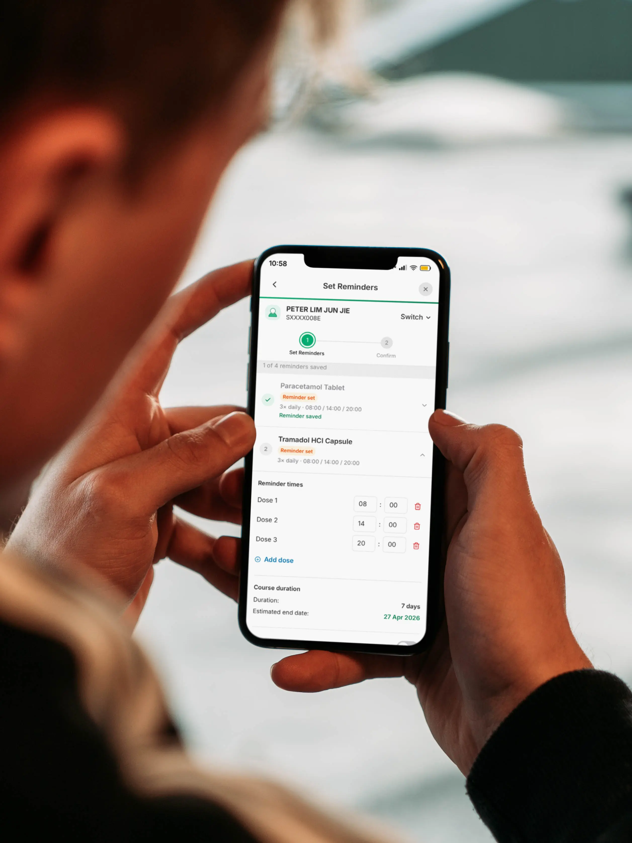
The prototype was put through a structured round of usability testing across five core tasks, each targeting a critical point in the user journey. What followed was an iterative loop of observation, synthesis, and redesign.
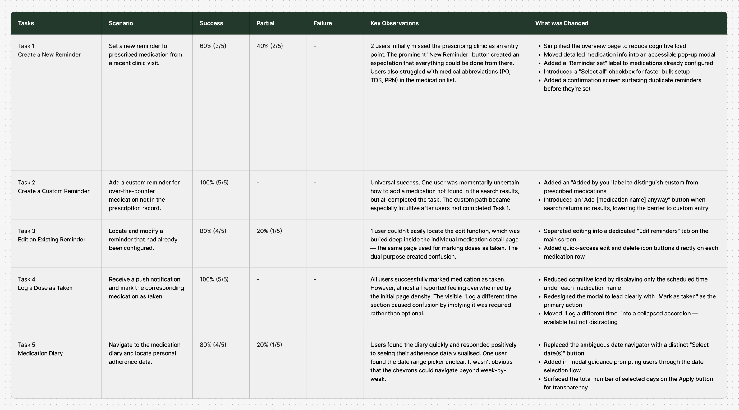
Five tasks were tested, each targeting a critical moment in the medication journey – from setting up a reminder to logging a dose to checking adherence over time. Most tasks performed well, but two surfaced friction worth fixing: users struggled to notice the prescribing clinic as an entry point, and medical abbreviations like PO and TDS created confusion during setup. Each finding fed a specific revision – clearer entry points, plain-language medication details, and a confirmation step to catch duplicate reminders before they happened.
After five tasks and a structured iteration cycle, the final prototype delivered strong, measurable results.
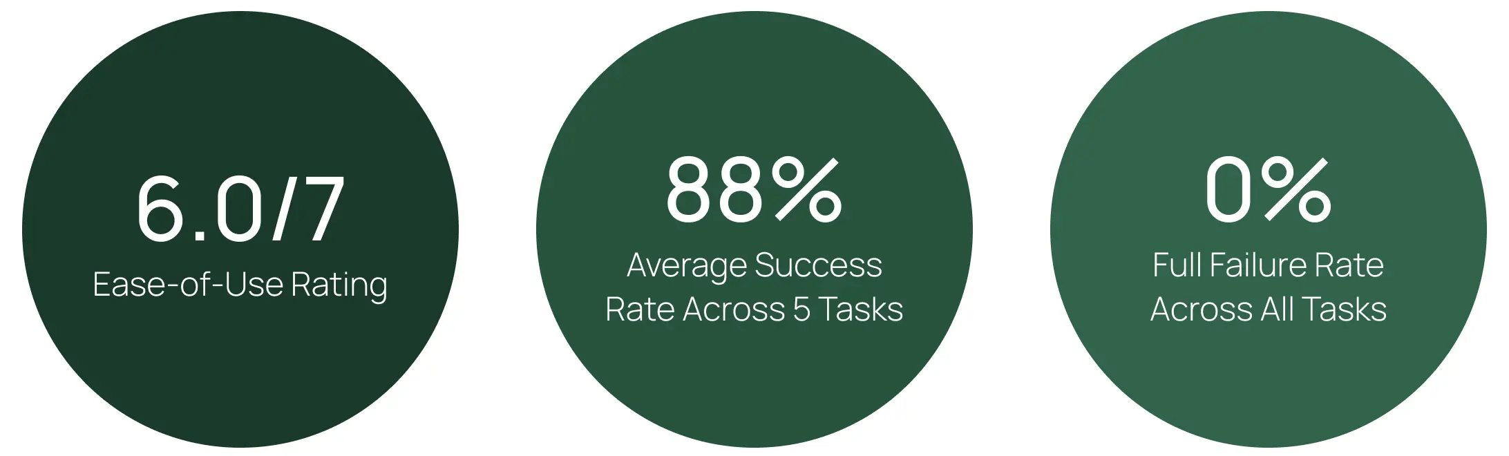
Notably, not a single user fully failed any task. Partial completions reflected friction points that were identified and addressed through iteration. The 0% full failure rate, even on the first prototype, validated that the core concept was sound and the design direction was well-chosen.
Conclusion
The core insight driving this project was simple but significant: HealthHub already had everything it needed to be part of users' daily lives. The prescription data was there. The medical records were there. What was missing was a feature that put that data to work in a way that felt effortless and personal.
Medication Reminders closes that gap. By pre-populating information from existing prescriptions, minimising the setup burden, and giving users a clear window into their own adherence over time, the feature transforms HealthHub from something users visit occasionally into something they return to every day. The pill boxes, the phone alarms, the scribbled notes -- all the workarounds users had quietly relied on for years were exactly what the feature was built to replace. Not by adding more to their day, but by finally putting the information HealthHub already held to work for them.
A daily reminder is more than a nudge – it's the beginning of a habit, and a habit is what makes an app genuinely valuable.